

The colors we choose for our homes have an incredible ability to affect how we feel, live, and experience our surroundings. A well-chosen color palette has the power to breathe life into a room, create a sense of calm, or infuse it with energy and personality. Whether you’re redecorating a single room or embarking on a full home makeover, choosing the right colors can be challenging. This guide will help you understand how to select a color palette that reflects your personality and suits your space while creating a harmonious environment.
1. Determine the Mood You Want to Create
The first step in choosing a color palette is to determine the mood you want for each room. Colors evoke emotions, so it’s important to think about how you want to feel in the space. Warm colors such as reds, oranges, and yellows are lively and energizing—perfect for social areas like the living room or dining room. Cooler tones like blues, greens, and purples create a sense of calm and relaxation, making them ideal for bedrooms or bathrooms.
If you’re aiming for a cozy, intimate feel, opt for warm earth tones such as terracotta or soft browns. On the other hand, if you want a space that feels fresh and serene, lighter blues and greens can help bring a tranquil atmosphere. Think about how the room will be used and the type of energy you want to cultivate there, and then narrow down the colors that best match that feeling.
2. Use the 60-30-10 Rule
One of the most helpful design principles for creating a balanced color palette is the 60-30-10 rule. This rule helps ensure that the colors in your room work harmoniously without overwhelming the space. It breaks down as follows: 60% of the room should be the dominant color, 30% should be a secondary color, and the final 10% should be an accent color.
For example, if you’re decorating a living room, you might use a soft neutral shade like beige or light gray as the dominant color, which would cover most of the walls and large furniture pieces. Then, a complementary color like a dusty blue could serve as the secondary shade for items like area rugs, curtains, or smaller furniture. Finally, an accent color—perhaps mustard yellow or a rich coral—could be added through throw pillows, artwork, or decorative accessories. The 60-30-10 rule keeps the color scheme cohesive and pleasing to the eye.
3. Consider the Existing Elements
When selecting a color palette, it’s essential to consider the existing elements in the room. Unless you’re starting from scratch, your home likely has features that can guide your color choices. This could include flooring, cabinetry, countertops, or architectural features that you aren’t planning to change. Instead of trying to ignore these elements, use them as the foundation for your color scheme.
For example, if you have rich wooden floors, you might want to choose colors that highlight the natural warmth of the wood. Likewise, if your kitchen has marble countertops with subtle gray veining, incorporating shades of gray or white into the rest of the space will ensure everything ties together seamlessly. Working with, rather than against, existing features can help create a more unified look.
4. Draw Inspiration from Nature
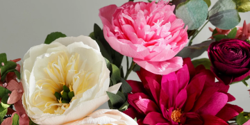
Nature is an abundant source of color inspiration. From the soothing greens of a forest to the blues of the sky or the sandy browns of a desert landscape, nature provides color combinations that feel organic and balanced. Consider incorporating shades inspired by nature to create a sense of harmony within your home.
For example, a beach-inspired palette might include soft blues, sandy beiges, and crisp whites, which evoke the calming qualities of the seaside. A forest-inspired palette could include rich greens, deep browns, and muted yellows, offering a cozy, earthy feel. Bringing elements of nature indoors can create a peaceful and timeless atmosphere that never feels out of place.
5. Test Colors Before Committing
Colors can look dramatically different depending on the lighting in a room. Natural light, artificial lighting, and even the direction a room faces can all influence how a color appears. Before committing to a color palette, it’s crucial to test your options. Purchase sample-sized paint cans and apply swatches of each color to the walls you plan to paint. Observe how each color looks at different times of the day, in natural daylight and under artificial lighting.
What may seem like the perfect shade on a paint chip can appear too dark or too dull once applied to an entire wall. By testing the colors first, you can avoid costly mistakes and ensure that the colors look exactly the way you want them to in your specific space.
6. Use a Color Wheel for Complementary Combinations
A color wheel is an invaluable tool when it comes to designing a color palette. Understanding basic color theory can help you create combinations that are visually appealing and harmonious. Complementary colors—those that are opposite each other on the color wheel, such as blue and orange or red and green—create a vibrant, dynamic contrast that works well for accent pieces or adding energy to a room.
Analogous colors, which are next to each other on the color wheel, offer a more subtle, soothing effect. For example, a palette of blues, teals, and greens can create a serene and unified space. Triadic color schemes, using three colors evenly spaced around the color wheel, such as red, blue, and yellow, can create a balanced yet lively palette.
Using a color wheel helps you explore different combinations, whether you prefer contrast or cohesion, and allows you to create a palette that suits your taste and the feeling you want to evoke in your home.
7. Start with a Neutral Base
If you’re unsure where to start, begin with a neutral base and build from there. Neutrals like white, beige, gray, and soft taupe provide a versatile canvas that you can easily layer with colors and textures. Neutrals are especially useful in open-concept homes where you want to create a cohesive flow between different areas while still allowing for distinct accents.
Once you have a neutral base, you can add color through accent walls, furniture, textiles, and decor. This approach allows for more flexibility, as you can change the overall look of a room by switching out accent pieces without having to repaint or make significant changes to the core design.
8. Don’t Be Afraid to Go Bold
While neutrals are a great starting point, don’t be afraid to incorporate bold colors into your home—especially in spaces where you want to make a statement. Accent walls, bold-colored furniture, or even a dramatic ceiling color can add personality and depth to your decor.
The key to successfully using bold colors is balance. If you decide to paint a wall a deep navy blue, keep the rest of the decor more understated to avoid overwhelming the room. Similarly, a bright, jewel-toned sofa can become the focal point of a living room, with other elements kept neutral to let the color shine.
9. Consider the Flow Between Rooms
If you’re choosing colors for multiple rooms, consider how the colors will flow from one room to the next. This is especially important in open-concept homes, where there are fewer physical barriers between spaces. Even in more traditional homes, having a cohesive color scheme can create a sense of unity throughout the house.
One way to create flow is by using variations of the same color throughout different rooms. For example, if you love blue, you might use a soft sky blue in the bedroom, a deeper navy in the living room, and blue-gray accents in the kitchen. This approach ties everything together while still allowing for individual personality in each space.
10. Let Your Personality Shine
Ultimately, your home should reflect your personality and taste. Don’t feel pressured to follow trends or stick to conventional color rules if they don’t resonate with you. If you love bright, bold colors, incorporate them in a way that feels right for you. If you prefer a muted, understated look, embrace that simplicity.
Your color choices should make you feel comfortable and happy in your home. Whether it’s a vibrant orange wall that energizes you in the morning or a calming green that helps you unwind at the end of the day, the right colors are the ones that make you feel good. Let your home tell your story by choosing a palette that resonates with your personal style and brings you joy.
Choosing the perfect color palette for your home is both a creative challenge and an opportunity to express yourself. With these tips in mind—considering mood, balance, flow, and personal preference—you can create a space that is not only beautiful but also uniquely yours. Color has the power to transform, and when chosen thoughtfully, it can turn your house into a home that feels just right.